Brand & Packaging Design — South of North Brewing Co.
Crowler Cans
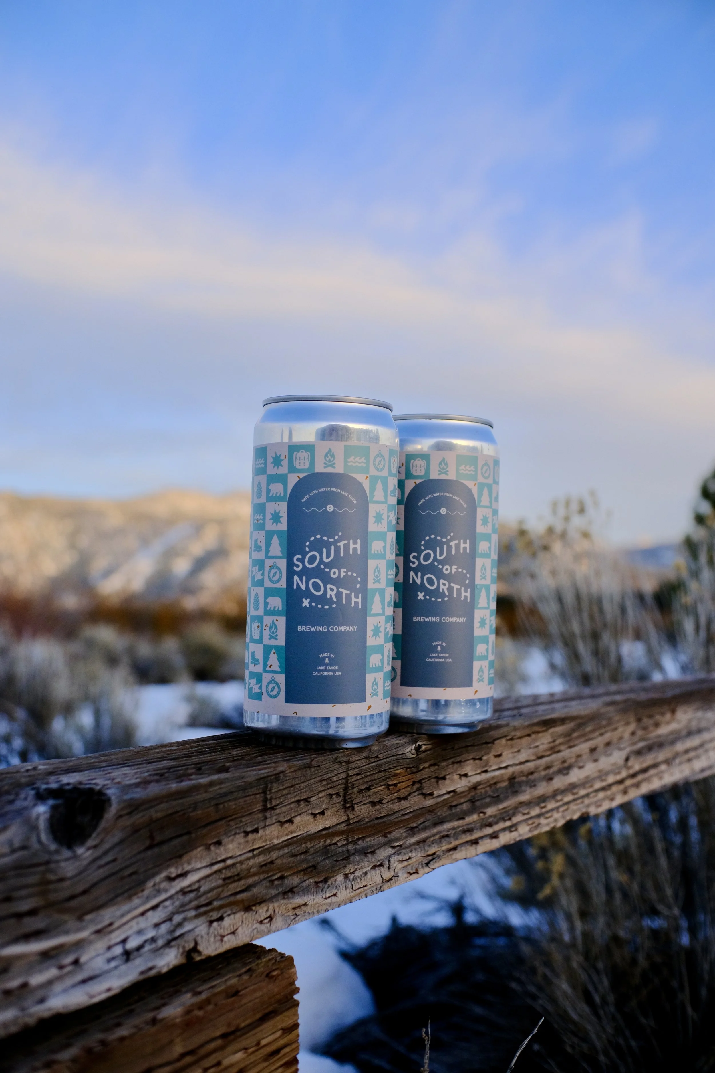
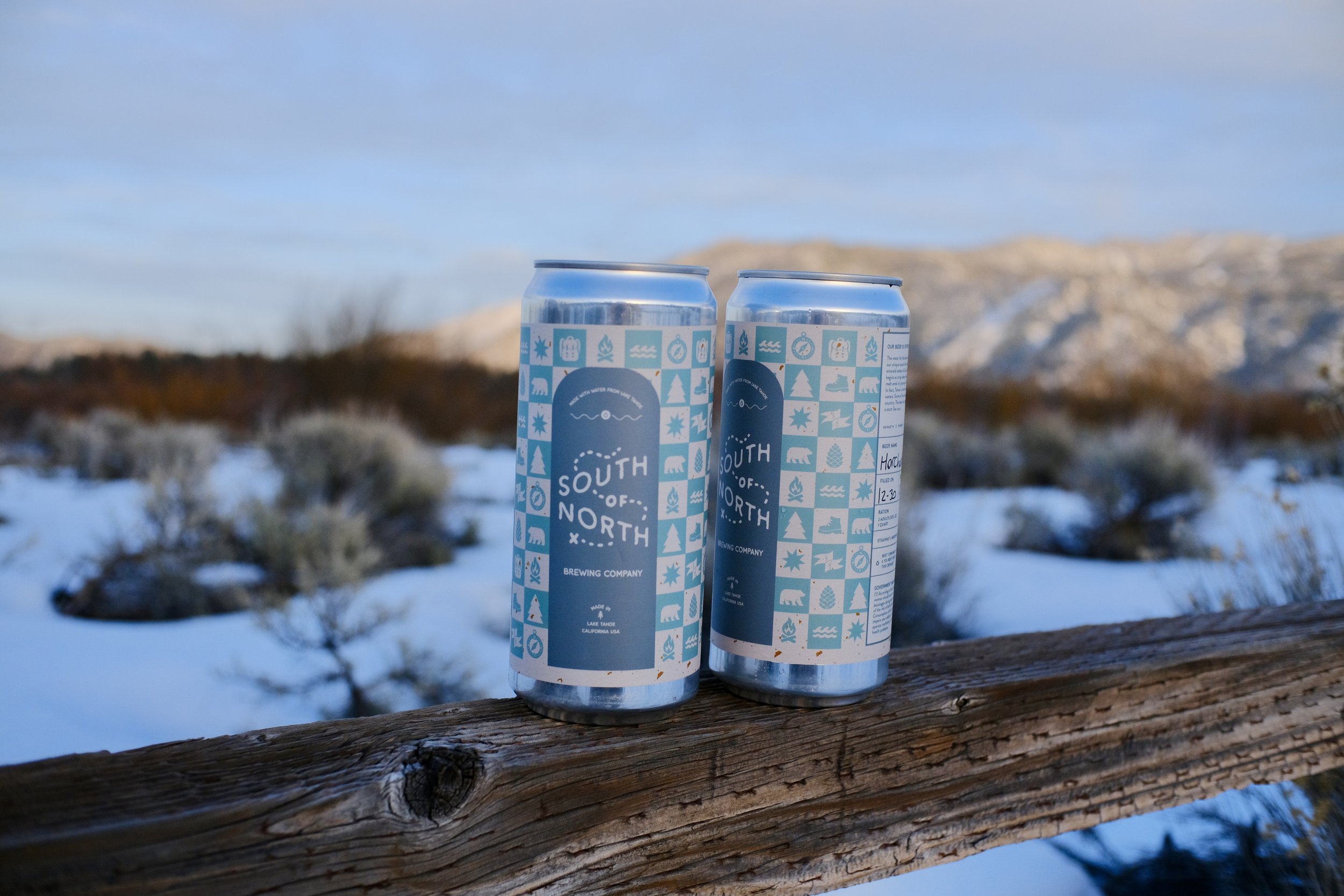
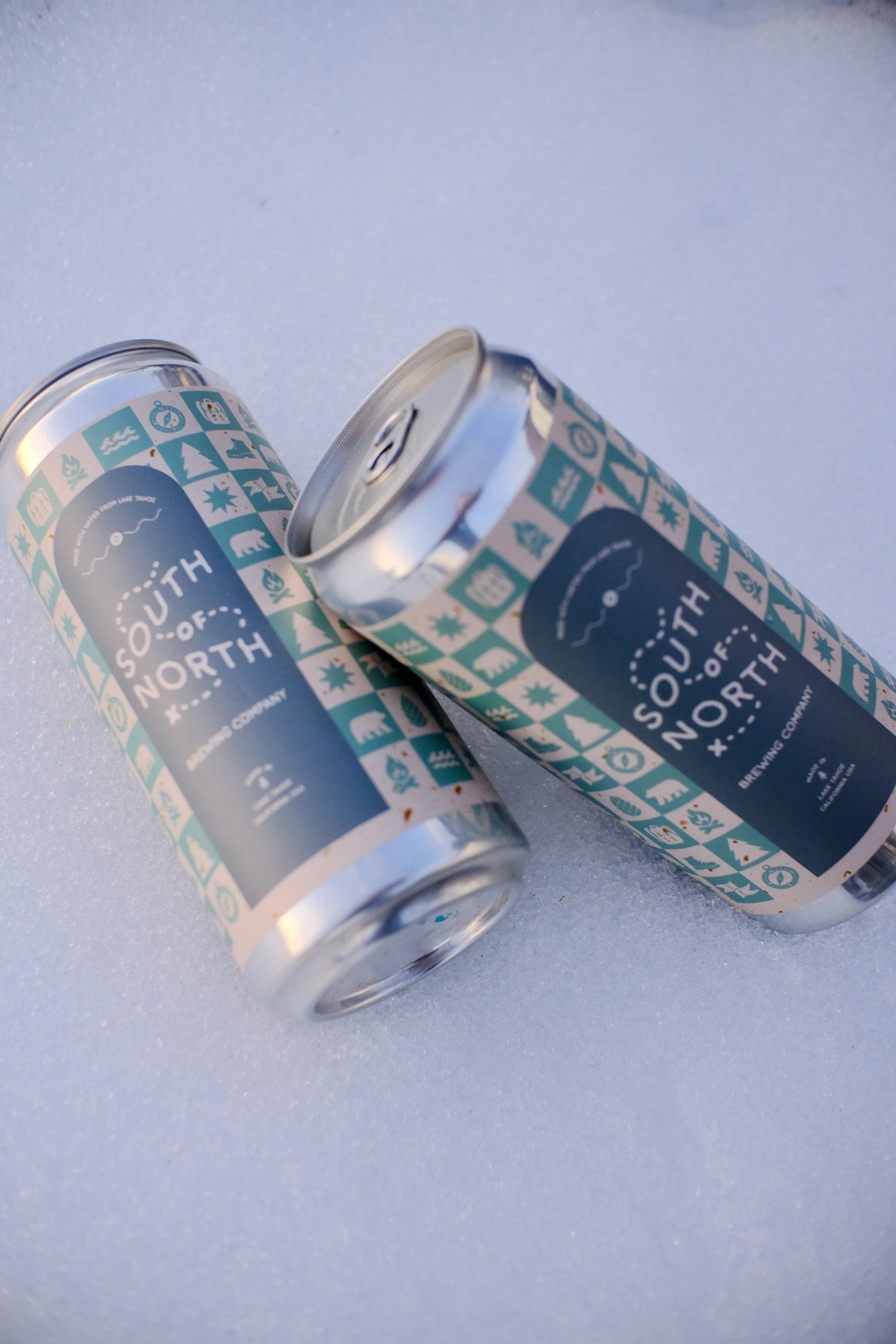
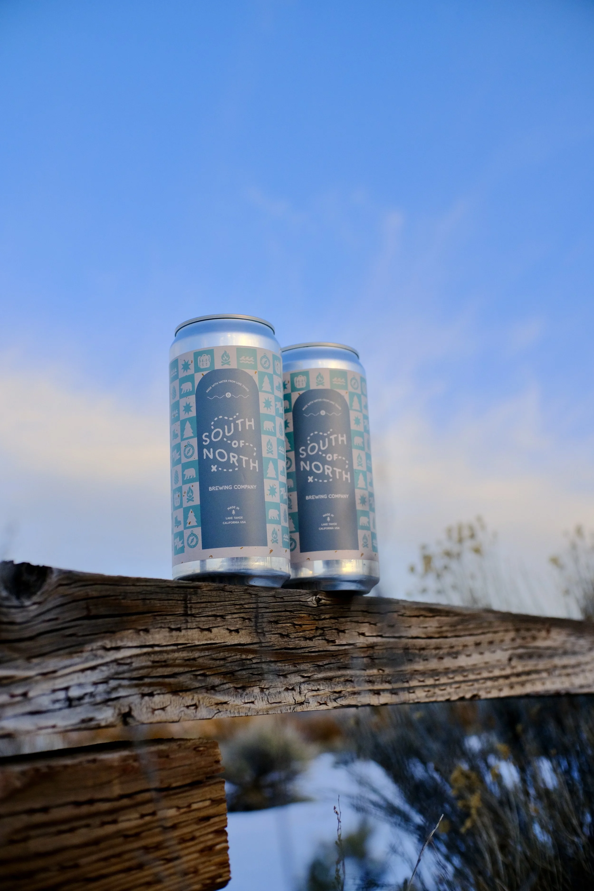
When South of North Brewery reached out, they wanted more than just a label. They wanted something that felt like Lake Tahoe. We worked through color together until landing on a teal and soft cream palette that matched their roaming, outdoor personality. From that foundation, I designed a custom icon set drawing from the Tahoe landscape and lifestyle. Pine trees, bears, campfires, compasses, and pinecones — tiled into a checkerboard pattern that wraps the full 360° of the can. The arched center panel grounds the brand name and gives the busy pattern a clean focal point. Shot against a snowy Eastern Sierra backdrop, these cans look right at home.